Braincool
2021
Designing for adherence when patients can't tolerate light
Problem area
Designing for the worst possible moment to use an app
A migraine attack is close to the worst possible context for a digital interface. People are in pain, often nauseous, and so sensitive to light that a bright screen can make the attack worse. That was exactly the moment CoolHead had to guide someone through positioning a medical device and answering questions accurately enough to support clinical conclusions.
Context: a day with migraine

Opportunity 1
Reduce cognitive load to the minimum. Guide people one step at a time, and never ask them to hold more than one thing in their head.
Opportunity 2
Design for light sensitivity rather than around it. Give people real control over colour and contrast instead of one fixed theme.
Design goals
What I aimed to achieve
Let people adjust their comfort
The interface should adapt to how someone feels, not the other way around.
Protect the trial data
Capture consistent, usable feedback without adding to the burden of an attack.
Design decision 01
Grounding the design in real migraine experiences
Before designing a single screen, I ran interviews with migraine patients and with clinicians who treat them. I wanted to understand what an attack actually takes away from a person: their ability to read, to decide, to tolerate light at all. I turned what I learned into personas and a day in the life journey that gave the team and the client one shared reference point.
From that point on, every decision about pacing, wording, and contrast had something concrete to point back to, rather than resting on anyone's assumption about how a migraine feels.

Research signals selected:
Expert input
Clinical perspective on the treatment and how patients use it at home.
Personas
Shared reference points, so the team designed for a person rather than a specification.
Journey mapping
The arc of an attack, and the moments the app needed to step in or stay out of the way.

The question framework behind the research, covering both clinicians and people living with migraine.
Design decision 02
One screen, one task
I structured the whole experience so that each screen carried exactly one instruction or one question. Selecting the treatment area, positioning the device, rating pain, answering a survey: each of these got its own screen, in plain language, with a clear confirmation after every action.
That meant accepting slower, more guided flows over denser screens that would have looked more efficient on paper. Efficiency is worth very little to someone who can barely keep their eyes open.
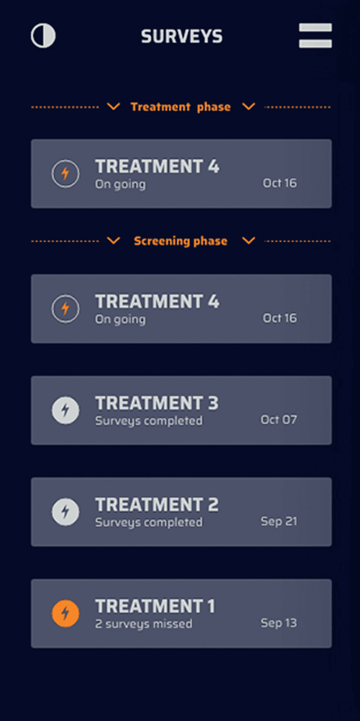


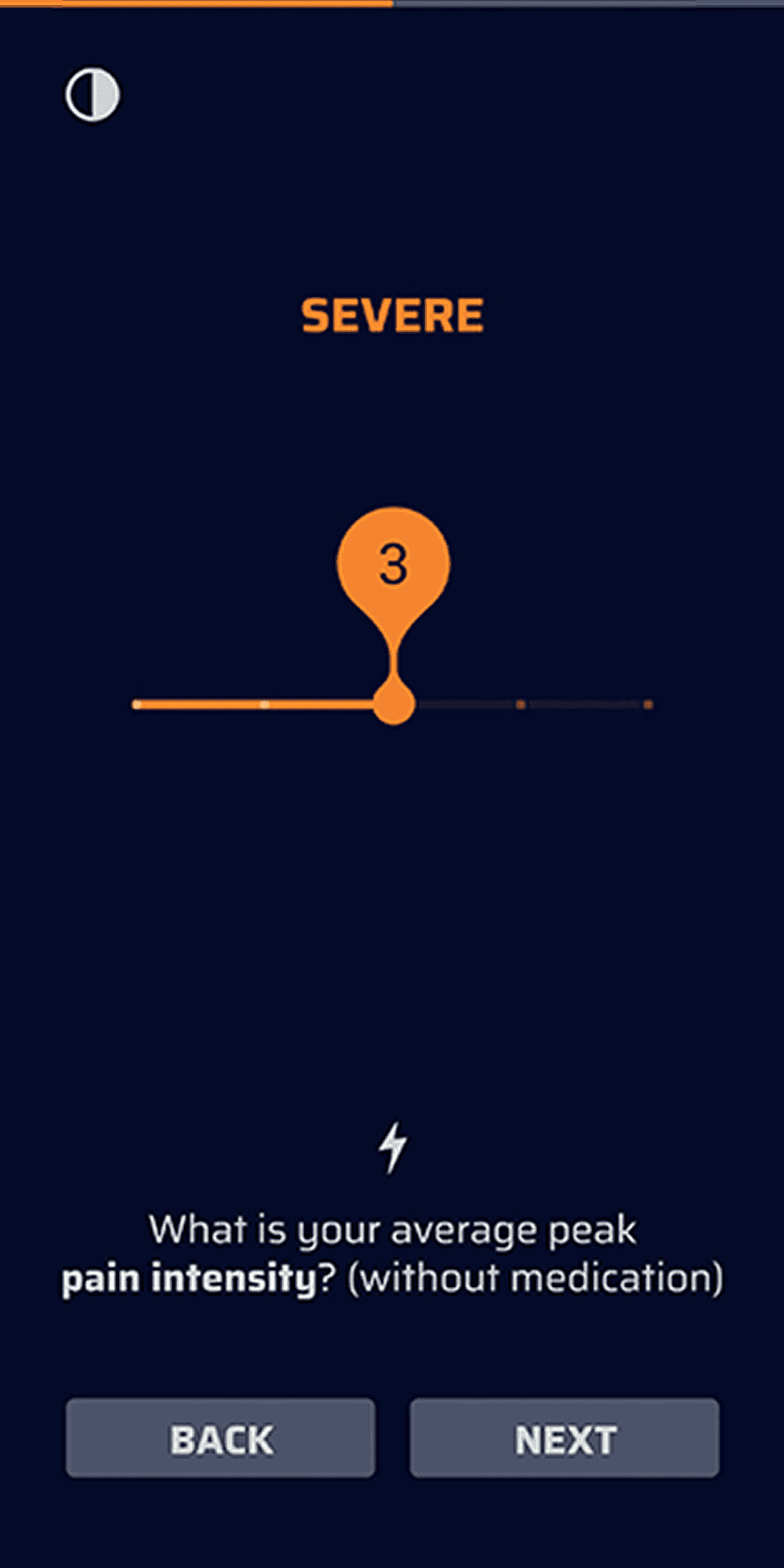
Each step in the treatment isolated to a single screen, from selecting the area to reporting how the attack felt.
01
Step-by-step guidance
Positioning the device correctly, one instruction at a time.
02
Plain language
Short phrasing that survives pain and distraction.
03
Clear feedback
The app always confirms what just happened and what comes next.
04
Answerable questions
Survey moments designed to be completed in seconds, so the trial data stayed consistent even during an attack.
Design decision 03
Making visual comfort adjustable, not assumed
Photophobia is one of migraine's most disabling symptoms, and tolerance for light and colour varies between people and even between hours of the same attack. A single muted theme would only have been a guess at what helps.
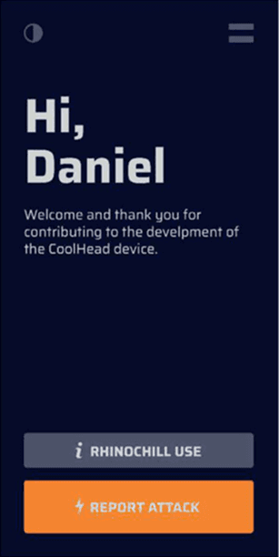
Instead I gave people an accent colour that carries across the entire interface, and a contrast control they can reach from any screen at any point in a session. Every combination was checked against accessible contrast standards, so that comfort never came at the cost of legibility.




01
Choose your accent colour
Applied consistently across text, buttons, and visuals.
02
Adjust contrast anywhere
Available on every screen, at any point in a session.
03
Nothing competing for attention
One instruction or question visible at a time, and nothing decorative around it.
01
Learning
One theme does not fit everyone. What soothes one person can be uncomfortable for another.
02
Learning
Comfort settings had to be reachable in the moment, not buried in a menu someone would have to go looking for.
Validation
Testing with real people, in context
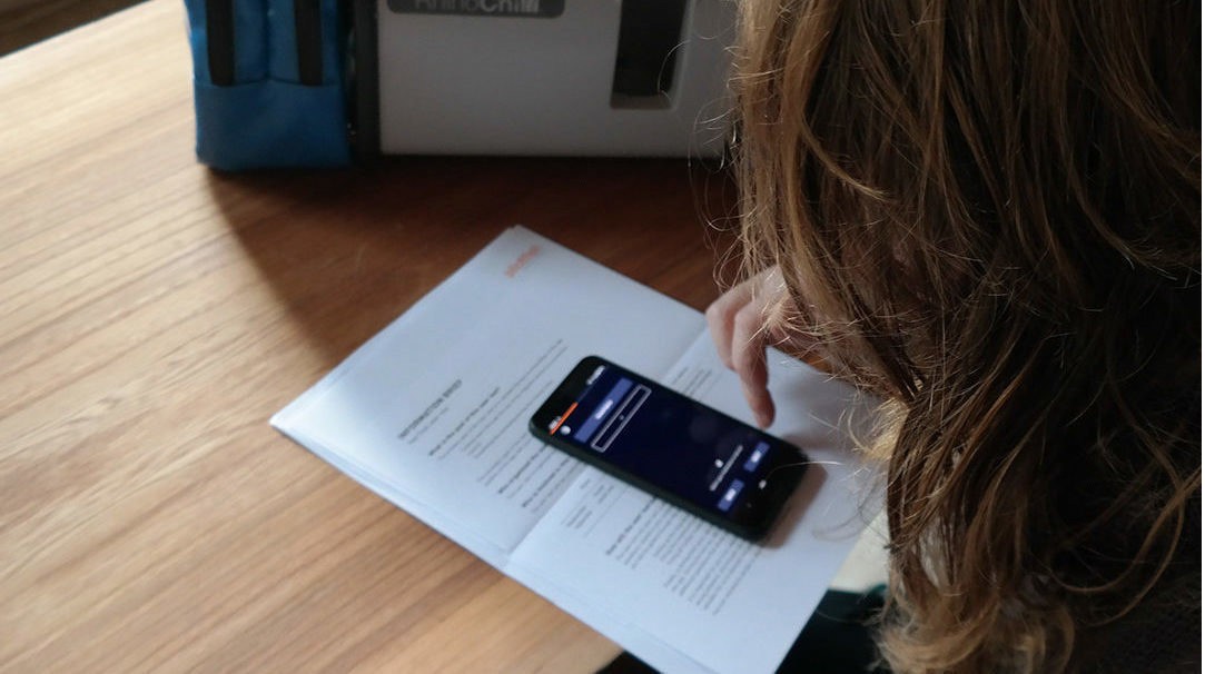
I tested the app with real users rather than relying only on what people described in interviews. Watching where someone hesitated, or reached for a control that was not there, consistently told me more than a conversation could.

Retrospective
Designing for the person, not just the trial
CoolHead set a principle I have carried into every healthcare project since: the harder someone's circumstances, the more restraint the design demands. The temptation in medical products is to show everything, because everything feels important. Most of the value here came from deciding what to leave off the screen.
Working closely with the developers through delivery kept that restraint intact in the build that went into clinical testing, which is ultimately the only version of a design that matters.
What I took from it
Research earns its keep later
The interviews were not the deliverable. They were what let me defend a hard call months afterwards.
Accessibility is structural
Treated as a constraint from day one it shapes good decisions. Added at the end it only ever patches bad ones.
Design ends at the build
Staying close to developers through delivery mattered more to the outcome than any single screen I drew.
"The real challenge was making something that is not overwhelming for a person in the middle of an attack, in pain, and barely able to tolerate light."